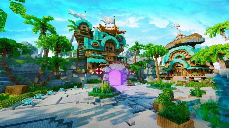
Every server owner has seen it happen: you launch a world with stunning builds, perfect textures, and a big vision—yet players leave after just a few minutes. The problem isn’t always content or creativity. More often, it’s layout.

Even the most beautiful worlds can fail when their design confuses players. The truth is, Minecraft layout mistakes silently destroy gameplay flow more than lag or bugs ever could.
A poorly structured world feels like a maze. Players wander aimlessly, miss key features, and lose motivation. But when your layout is designed intentionally—when navigation, landmarks, and sightlines all guide movement—your world feels alive and intuitive.
In this post, we’ll uncover the seven most common Minecraft layout mistakes that ruin otherwise amazing servers and explain how to diagnose and fix them before they drive players away.
Great Maps Fail When Layout Gets in the Way
It happens all the time: a server with professional-grade builds and eye-catching details launches to fanfare. But after the first wave of excitement, player engagement drops.
Players might say “it’s confusing” or “I couldn’t find anything,” even though the builds themselves look incredible. That’s because Minecraft, at its core, is about spatial storytelling. The way a world feels to move through matters just as much as how it looks.
The most successful builders know this: every archway, staircase, and corridor should guide behavior. That’s why Minecraft layout mistakes are so devastating—they break immersion, block flow, and make even beautiful maps feel frustrating.
Let’s look at the seven most common design errors that hold servers back—and how to fix them for good.
No Clear Path From Spawn
The first and most damaging mistake is poor spawn layout. If players don’t immediately understand where to go, they’ll leave before they ever see what your world has to offer.
When players spawn in, their attention is scattered. They’re taking in lighting, textures, and sounds all at once. The last thing they want is to guess which direction to move.
A clear spawn path should:
- Lead naturally toward important areas (shops, portals, warps).
- Use lighting or color cues to frame exits.
- Provide visible waypoints—like statues, arches, or banners.
Without this structure, players stand still or wander in the wrong direction. And once confusion sets in, frustration follows.
Many Minecraft layout mistakes start right here, at spawn. Fixing it doesn’t require rebuilding everything—just clarify your direction with purposeful flow lines, distinct elevation, and visual anchors.
Portals or Warps Hidden or Scattered
Your server’s most important transport tools—portals, NPCs, or warps—should be obvious at a glance. Yet many maps hide them behind decor, in corners, or across multiple layers.
While that might look “realistic” or cinematic, it kills usability. Players shouldn’t have to explore for five minutes just to find how to reach the Nether or teleport to an arena.
Centralize your warps. Place them around your main hub in symmetrical or circular patterns. Use lighting and texture to distinguish each one. For example, an obsidian frame for Nether travel, quartz for Creative mode, or emerald blocks for your shop world.
Simple visibility fixes like these eliminate one of the most common Minecraft layout mistakes—forcing players to search for essential systems.
Unbalanced PvP Zones
Aesthetics and functionality must coexist in any PvP environment. Too often, maps prioritize beauty over balance—creating arenas that look amazing but play terribly.
Common PvP layout problems include:
- Uneven elevation giving one team constant advantage.
- Too many obstacles blocking line of sight.
- Overly symmetrical maps that feel repetitive.
Players notice these flaws instantly. Poorly designed PvP spaces lead to frustration and quick drop-off rates.
To fix this, test your arenas from multiple roles and angles. Use spectator mode or third-person to check how movement flows. A balanced PvP map should allow multiple strategies, not one dominant one.
Avoid the trap of designing for screenshots instead of gameplay. The best Minecraft layout mistakes to correct are the ones that prioritize fairness and flow over visual showpieces.
Dead Zones With No Function
Every build should serve a purpose. Unfortunately, many worlds include vast areas that look nice but do nothing—empty courtyards, unused hallways, or decorative plazas.
Dead zones kill engagement. Players avoid them, server space goes to waste, and performance can even suffer due to unnecessary detail.
Instead, think of every area as part of your gameplay ecosystem. A plaza could host an event board. A hallway could lead to an information kiosk. Even small corners can feature hidden lore, NPCs, or collectibles.
Functional design keeps players moving. It also encourages exploration because every zone feels meaningful.
When reviewing Minecraft layout mistakes, always ask: “What happens here?” If the answer is “nothing,” it’s time to reimagine the space.
No Elevation or Visual Anchors
Flat worlds are boring. Even with great builds, if your layout lacks depth, players won’t feel immersed.
Elevation and anchors are what give a world structure. Stairs, slopes, balconies, and multi-level design help create movement and flow. Visual anchors—like towers, trees, or glowing crystals—help players orient themselves and remember where they’ve been.
Without these, everything feels samey. Players lose direction easily, and your map’s identity fades.
Elevation also affects camera flow. When you include vertical elements, players instinctively look up, creating a sense of scale and wonder. That emotional cue is what makes great worlds memorable.
This is one of the simplest Minecraft layout mistakes to fix: break up your terrain, introduce vertical variety, and give players a reason to look around rather than just forward.
Shops or Features Placed Far From Player Hotspots
You’ve built a beautiful shop district—but no one visits it. Why? Because it’s too far from spawn or too disconnected from active zones.
Proximity drives activity. Players naturally spend time where people gather—usually near spawn, portals, or event areas. If your shops, quest boards, or ranking halls are placed away from those spots, they’ll be ignored.
The fix is simple: design your server around player flow, not builder logic. Place key features along the main loop of travel, where players already pass through. This ensures consistent visibility and interaction.
Think of your world like a theme park — attractions are close together, connected by intuitive paths. That principle alone can solve half your Minecraft layout mistakes instantly.
No Spatial Logic
Every world needs internal logic. Players may not consciously analyze it, but they feel when something doesn’t make sense.
A desert hub leading to a snowy shop? A Nether portal sitting inside a treehouse? These break immersion. Your environment should tell a coherent story.
Spatial logic keeps the world believable. Group related features together, maintain consistent themes, and use architectural style to signal function. A fantasy tavern should look inviting, not industrial. A space station shouldn’t lead to a medieval castle.
When layouts ignore thematic consistency, players feel disconnected — even if they can’t explain why.
Among all Minecraft layout mistakes, this one is the most subtle, but also the most destructive. A world without logic quickly becomes a world without emotion.
How to Diagnose and Fix Them
Recognizing layout problems is one thing; fixing them is another. Fortunately, even complex issues can be corrected with smart testing and a designer’s eye.
Here are practical ways to identify and eliminate Minecraft layout mistakes before your next launch.
Ask Playtesters for Feedback
Invite players who have never seen your world to explore it for the first time. Observe where they hesitate, backtrack, or ask for help. These moments reveal weak navigation or unclear flow.
You can even create invisible checkpoints to track movement paths. If most players avoid an area, it’s either too hidden or uninteresting. Use that data to refine your design.
Use Third-Person or F5 View
Perspective matters. Builders often design from first-person view, but players experience your world dynamically. Switch to third-person to analyze how your spawn and layout look from cinematic angles.
You’ll spot awkward camera blocks, overly tight corridors, or flat vistas that need more vertical variation. This technique is one of the simplest yet most effective ways to detect Minecraft layout mistakes visually.
Add Signage, Lighting, and Path Cues
Clarity is king. A few subtle lighting adjustments or directional signs can transform navigation. Use materials and contrast to your advantage — paths made of lighter blocks, warm lanterns leading to exits, and banners marking key areas.
Players appreciate intuitive worlds that “teach” them where to go without text walls or complex maps. Light their way — literally — and your layout will feel polished.
Revisit Scale and Player Speed
Your world’s sense of distance matters. Large builds look amazing but can feel empty if players have to sprint too long between points of interest. Use landmarks and density to compress travel time.
Balance is the secret ingredient. The most effective Minecraft layout mistakes fixes come from thinking about movement as much as building.
Skip the Mistakes — Start With Layouts That Just Work
You don’t need to learn every layout lesson the hard way. With the right foundation, your server can launch with professional structure, flow, and navigation from day one.
At Keystone Builds Collections, we specialize in pre-built worlds and hubs tested for usability and player psychology. Every map is designed to eliminate the Minecraft layout mistakes that frustrate players most — from unclear spawns to dead zones.
Our builds feature:
- Intuitive paths and wayfinding architecture
- Optimized PvP and community zones
- Balanced elevation and visual anchors
- Thematic consistency and functional layout logic
When players join a Keystone map, they know where to go, what to do, and how to feel — without ever needing instructions.
If you’re ready to launch a server that feels effortless to explore, explore Keystone Builds Collections today.
Because in Minecraft, great design isn’t just about beauty — it’s about flow. And when your layout works, everything else falls perfectly into place.