Every builder eventually faces the same creative crossroads — how do you make something that’s not just beautiful, but also useful? In the world of Minecraft, where design and gameplay collide, this is one of the most important questions you can ask. The debate around aesthetics vs functionality Minecraft builds has shaped countless servers, communities, and maps.

A build can be breathtaking to look at — filled with intricate detail, symmetry, and realism — but if players can’t navigate it or use it comfortably, it fails as a game space. On the other hand, a purely functional layout might run perfectly but feel lifeless and uninspired.
Finding the middle ground is an art form. The best maps are those where visual storytelling supports gameplay rather than competing with it. This post will help you understand that balance — why it matters, how to achieve it, and how the most successful worlds in Minecraft make both sides of the equation work together.
Pretty Isn’t Enough — But Neither Is Practical
Minecraft’s greatest strength is freedom. You can build anything, from pixel-perfect modern cities to abstract survival hubs. But that same freedom creates tension between two core goals: aesthetics vs functionality Minecraft builds.
Beautiful builds inspire wonder. Players join, take screenshots, and admire craftsmanship. But if there’s no clarity — if warps are hidden behind décor or paths feel confusing — beauty turns into friction.
Functional builds, on the other hand, prioritize efficiency. Every path is clear, every portal obvious. Players always know where to go. Yet without aesthetic appeal, the world feels empty, sterile, and forgettable.
The truth is, great server design requires both. You’re not just creating an environment — you’re crafting an experience. When aesthetic and functional goals align, players move naturally through the world while feeling emotionally connected to it.
In the balance between art and logic lies the magic of Minecraft design.
Why Aesthetic vs Function Is a Common Design Dilemma
Every builder wants to impress. It’s human nature — we love to create something that looks spectacular. But servers aren’t museums; they’re living, breathing environments. The most common reason aesthetics vs functionality Minecraft builds clash is because builders and players see the world differently.
Builders focus on expression, composition, and artistic flow. Players focus on usability, direction, and comfort. When those two perspectives don’t align, frustration builds on both sides.
Builders Want to Wow
Builders pour hours into details: custom trees, ornate ceilings, textures layered with precision. Their goal is to craft a masterpiece worth admiring. But without gameplay consideration, those details can block navigation, obstruct sightlines, or overload performance.
A stunning courtyard filled with statues might photograph beautifully — but if there’s no clear exit or purpose, players feel lost.
Players Want to Understand and Move
For players, clarity equals enjoyment. They want to know where to go, what to do, and how to get there fast. When a world communicates poorly, players stop exploring.
Think about it: how many times have you joined a server and immediately asked in chat, “Where’s the shop?” or “How do I leave spawn?” That’s a design failure, not a player error.
When form overpowers function, your server becomes confusing. When function ignores form, your server becomes forgettable. The best aesthetics vs functionality Minecraft builds bridge that gap seamlessly.
Bad Balance Leads to Frustration or Boredom
When the balance tips too far one way, the results are predictable:
- Too aesthetic? Players get lost.
- Too functional? Players get bored.
Good design communicates without words. It guides players intuitively through space while evoking emotion. The sweet spot lies in making form follow function — not replace it.
Key Design Principles That Merge Both
Mastering the balance between aesthetics vs functionality Minecraft builds requires intention. You have to think like both a builder and a player. The best worlds don’t sacrifice beauty for usability — they blend them into one cohesive experience.
These design principles can help you find that balance every time you create.
Form Follows Function
This classic design principle applies perfectly to Minecraft. Before building anything, define its purpose. What is this area for? A spawn? A quest hub? A PvP arena?
Once you know the function, shape the form around it. For example:
- A spawn should prioritize sightlines and path clarity.
- A shop area should center around accessibility and flow.
- A parkour zone should emphasize visibility and color contrast.
When purpose leads design, beauty naturally aligns with usability.
Use Color and Light to Guide
One of the simplest yet most effective aesthetics vs functionality Minecraft builds techniques is directional lighting and color psychology. Warm light attracts attention; cool light creates calm.
Use lighting and contrast to lead players. Soft glows along pathways act as subconscious arrows. Different materials — like sandstone for safe areas and obsidian for danger zones — communicate meaning without needing signs.
Players instinctively follow brightness and clarity. A well-lit, color-coordinated path is more effective than any warp label.
Don’t Overdecorate Navigation Paths
This is a mistake almost every creative builder makes at some point. You want your corridors or plazas to look impressive, so you fill them with detail — fences, banners, lanterns, plants, armor stands, you name it.
But players don’t see art the way builders do. They see information. When there’s too much detail, their brain doesn’t know what to focus on.
Keep main routes open and clean. Let decorative detail live around the edges. Think of navigation paths like roads — they should feel deliberate and uncluttered. It’s one of the most overlooked yet powerful aesthetics vs functionality Minecraft builds rules.
Use Decorative Objects as Functional Signs
The best designs use decoration as communication. Instead of random props, give them meaning.
A torch by a doorway signals direction. An armor stand next to a staircase marks a checkpoint. A colored carpet indicates a safe zone. Players quickly learn these visual cues without needing text or explanation.
This concept — “decoration as instruction” — transforms ordinary builds into intuitive spaces. It’s how professional map designers blur the line between form and function.
When beauty and purpose merge, players feel guided rather than directed.
Real Examples of Balanced Builds
At Keystone, we see this principle in action across hundreds of projects. Our team constantly studies the relationship between visual appeal and practical design. Some of our most successful creations show how aesthetics can enhance usability instead of hindering it.
The Modular Lobby Design
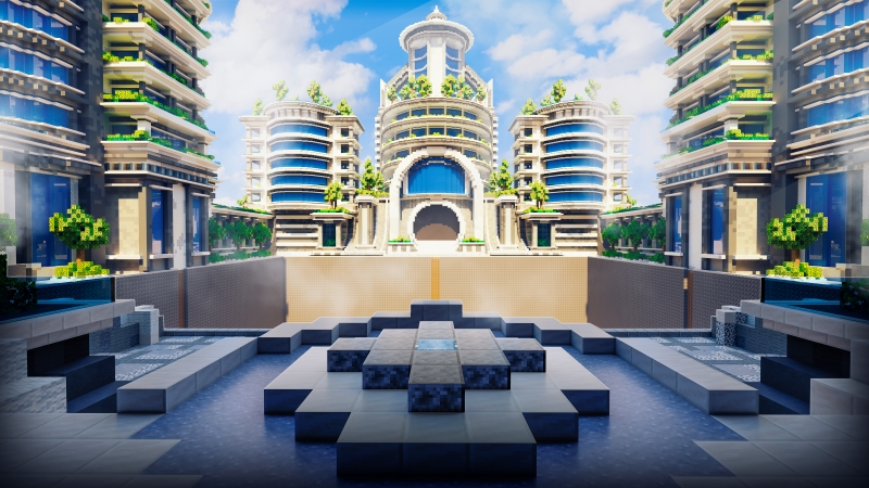
In one of our flagship lobbies, we built a circular spawn with layered elevation — the center draws the eye while outer paths lead to portals and shops. The symmetry keeps movement natural, while balanced lighting ensures clarity.
The design looks cinematic, but every architectural choice serves gameplay. Players can always see their options, and no space feels wasted.
This layout shows how aesthetics vs functionality Minecraft builds can coexist perfectly — a structure that looks complex but feels intuitive.
Adventure Maps with Narrative Flow
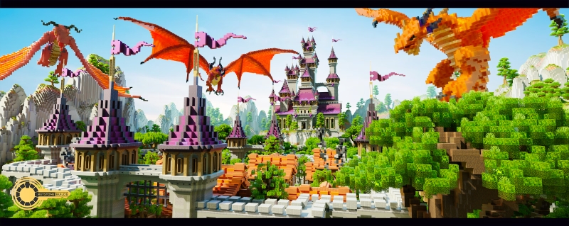
For our story-based builds, we prioritize environmental storytelling. Each biome or zone tells part of the narrative while maintaining clear direction. Lighting shifts with emotion — warm in safe areas, cold in mysterious ones.
We’ve learned that function doesn’t have to interrupt storytelling. In fact, it can reinforce it. When a player finds a glowing cave that leads exactly where they hoped, immersion deepens. That’s design harmony at work.
PvP Arenas That Balance Symmetry and Personality
Many PvP maps fall into extremes: overly symmetrical or visually messy. Ours strike balance by using terrain variation for tactical gameplay while maintaining a readable structure.
The result? Matches feel fair and visually immersive. Players can appreciate the beauty while understanding how to move strategically. That’s the real-world payoff of getting aesthetics vs functionality Minecraft builds right.
Choose Maps That Blend Form and Function
Building balanced maps takes time, testing, and experience. But you don’t have to learn every lesson the hard way. If you want to skip the trial and error, start with worlds already optimized for both visual impact and playability.
At Keystone Builds Collections, every map is designed with this balance in mind. Our team of professional builders crafts environments where art and usability work hand-in-hand.
Our maps feature:
- Clear navigation paths built into visually striking layouts
- Lighting and palette harmony that support gameplay flow
- Elegant design elements that communicate direction naturally
- Modular structures ideal for servers, lobbies, and events
Each world we build is tested for readability, navigation, and retention. Players don’t just admire these builds — they engage with them.
If you want your server to feel both beautiful and functional, explore Keystone Builds Collections today. Discover worlds that look stunning without sacrificing clarity — and learn firsthand how the best aesthetics vs functionality Minecraft builds balance imagination with purpose.
Because in Minecraft design, beauty draws players in — but function makes them stay. The perfect world gives them both, seamlessly.