If players can’t find their way, they leave. It’s that simple. Every world, no matter how beautiful, fails when navigation gets in the way of enjoyment. That’s why mastering Minecraft server navigation design is one of the most essential skills for server owners and builders.

When players log in, they don’t want to wander aimlessly — they want to explore with purpose. They want to feel confident that every turn leads somewhere intentional, every landmark has meaning, and every portal feels like part of a grand design.
Good navigation isn’t about adding arrows or signs everywhere. It’s about making the world speak for itself. When players move through a map that feels intuitive, they subconsciously think, “this server just makes sense.” And that feeling builds trust, engagement, and retention.
In this guide, we’ll explore how to use architecture, color, lighting, and flow to guide your players without overwhelming them — creating worlds that are both immersive and navigable.
Because a player who knows where to go is a player who stays.
If Players Get Lost, They Log Off
It doesn’t matter how detailed your builds are or how many features your server offers — if players can’t find them, they might as well not exist. Confusion is the silent killer of player engagement, and poor navigation is almost always to blame.
Think about it: players join your world full of excitement. They spawn in, look around, and expect the game to “teach” them where to go next. If your layout doesn’t do that instinctively, the immersion breaks instantly.
Great Minecraft server navigation design eliminates uncertainty. It gently guides players from curiosity to clarity without forcing them. Instead of shouting, “Go here!” with signs, it whispers through light, form, and flow.
The best servers don’t tell players what to do — they show them. And that difference defines the line between chaos and cohesion.
When navigation works, players explore naturally, remember your layout subconsciously, and come back because the world feels easy to understand.
Navigation as a Design Language
Navigation isn’t just a function — it’s a visual language. The way you arrange structures, light pathways, and position focal points all communicate meaning. Players don’t need written instructions when your world’s layout “talks” to them.
That’s the essence of good Minecraft server navigation design: every visual element contributes to understanding and flow.
Use Landmarks and Visual Hierarchy
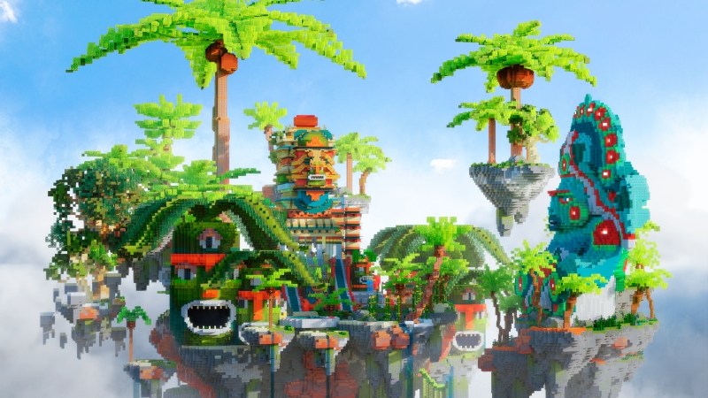
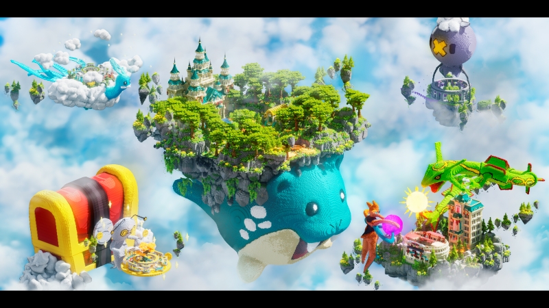
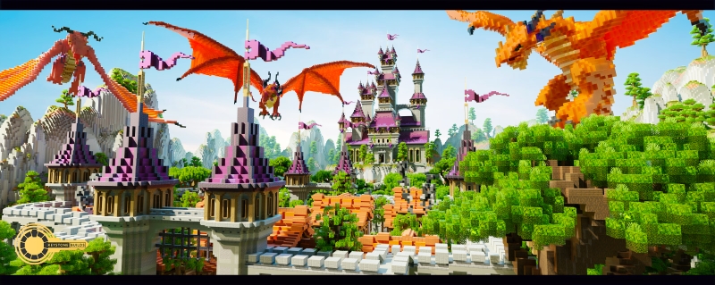
Landmarks are the anchors of any navigable world. They give players orientation and memory cues. A tall tower, glowing tree, or unique statue near spawn helps players instantly recognize their surroundings.
Landmarks should be visible from multiple angles, acting like beacons that help players find their way back without relying on coordinates.
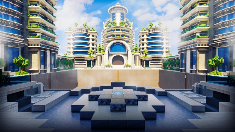
Visual hierarchy also plays a key role. Your most important structures — spawn centers, shops, portals — should be larger, brighter, or more detailed than secondary elements. The human eye naturally gravitates to prominence, so use scale and color to show importance.
This principle alone transforms Minecraft server navigation design from guesswork into guided experience.
Place Focal Points in Lines of Sight
Players follow what they see. Every path, stairway, and bridge should lead their gaze toward something significant. If your world feels like it’s constantly “pointing” players forward, you’re doing it right.
Avoid dead ends or paths that lead to nothing. Instead, make sure each corridor, archway, or elevation change reveals something new — a building, a light source, a portal frame.
The strongest Minecraft server navigation design uses composition like photography: framing destinations to reward curiosity and keep players moving.
Don’t Make Players Guess
Mystery builds excitement, but confusion destroys it. Players shouldn’t need to read a guide to understand your world. Keep portal placement logical, layouts symmetrical, and transitions smooth.
Ask yourself: if someone joined this server with no context, could they find the main features in 30 seconds? If not, it’s time to simplify.
Clarity doesn’t mean boring — it means confidence. Your world should make sense before it even needs to impress.
Practical Tools That Guide Players Naturally
The best navigation isn’t built with signs or commands; it’s woven into the world itself. Using architectural and environmental tools, you can lead players subtly yet effectively.
Here are some practical ways to turn Minecraft server navigation design into an art form.
Use Elevation and Path Contrast
Players notice contrast. Changing elevation — through stairs, ramps, or slopes — helps separate spaces and signal direction. If everything sits on one flat plane, the world feels disorienting and static.
Add gentle rises to indicate progress or highlight key areas. Combine that with path contrast: use different materials for walkways versus surroundings. Stone against grass, light wood against dark terrain — these differences guide players without needing signs.
Small variations in height and color subconsciously say, “this way.”
This simple trick can fix one of the most common Minecraft server navigation design problems — unclear movement paths.
Frame Portals or Warps with Architecture
Portals and warps are crucial waypoints, but many servers hide them behind random decorations or scatter them around hubs. Instead, make them part of the design language.
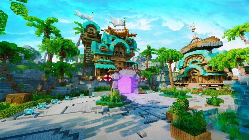
Frame your portals with arches, pillars, or unique materials that stand out. Think of each one as a doorway worth noticing. When players see consistent framing, they immediately recognize, “that’s a transition point.”
Symmetry helps too — evenly spaced portals around a central hub make navigation effortless.
Framing is both practical and aesthetic — one of the cleanest Minecraft server navigation design techniques available.
Cluster Related Features
Players appreciate logic. Shops near banks, arenas near spawns, quest givers near event boards — these clusters make your world feel organized.
When features are scattered randomly, players feel disconnected from the environment. But when related areas share proximity and theme, the world feels coherent.
Think of your server as a small town: zones should form natural “districts” that help players mentally map the area.
Smart clustering also reduces travel fatigue — a major win for Minecraft server navigation design and player satisfaction alike.
Tips for Multi-Zone Servers
If your server includes multiple worlds or themed areas, navigation design becomes even more important. Without structure, players quickly lose orientation or forget where key content lives.
Here’s how to make multi-zone worlds easy to navigate while maintaining immersion and style.
Color-Code Areas
Color is one of the strongest navigational tools available. Assign each world or region a dominant hue — blue for water zones, orange for nether regions, green for nature hubs.
Use this color consistently across builds, lighting, and banners. Players will quickly associate colors with destinations, making large servers easier to memorize.
It’s a professional-level Minecraft server navigation design trick that improves player experience without adding any complexity.
Use Visual Icons or Banners
Symbols are universal. Add icons or banners to reinforce area identity — a sword for PvP, a coin for economy zones, a pickaxe for survival.
These don’t need to be labeled. Just seeing the symbol subconsciously communicates purpose. Combined with color-coding, this creates a visual language your players can learn instantly.
Avoid “Portal Spam”
One of the worst offenders in Minecraft server navigation design is the “portal wall” — dozens of teleport options jammed into one space. It looks cluttered, overwhelms new players, and breaks immersion.
Instead, limit your main hub to a few major destinations and branch out from there. For example: one portal to “Adventure,” another to “Minigames,” and one to “Events.” Each of those worlds can contain their own local warps.
This structure mimics real-world wayfinding — major highways first, side roads later. It keeps your hub clean and digestible.
Keep the Hub Focused
Your central hub is the heart of the server. It should feel open, balanced, and easy to understand. Avoid mixing too many functions in one space.
Instead, let the hub introduce players to your world’s theme and give them clear, intuitive access to what comes next. The more focused it is, the more memorable it becomes.
A strong hub isn’t the biggest — it’s the most readable.
Use Maps That Feel Instinctive to Explore
A great server isn’t just built — it’s designed to be understood. When your navigation works, players don’t think about getting lost; they just enjoy the world. And that’s the hallmark of great Minecraft server navigation design — it feels invisible, natural, and effortless.
If you want to skip the guesswork, start with maps crafted for clarity from the ground up.
At Keystone Builds Collections, our worlds are designed with navigational psychology at their core. Each map is tested for flow, readability, and player behavior — ensuring every path, portal, and elevation change makes sense.
Our maps feature:
- Intuitive layouts and landmark-based navigation
- Framed portals and logical clustering for hubs
- Clear color and lighting schemes for direction
- Optimized space balance for performance and exploration
Players shouldn’t have to think about where to go — they should just know.
Explore Keystone Builds Collections today and discover pre-built hubs, lobbies, and adventure maps that make navigation part of the experience, not the obstacle.
Because when design and direction work together, players don’t just visit your world — they make it their home. And that’s what great Minecraft server navigation design is all about.